Share
Building an interactive card stack
In this lesson we'll learn how to build the interactive card component that I recently shared on Twitter.
It's a preview for a course I'm working on. I'll share some more details at the end of this page.
I'll be sending the remix link out to any waitlisters later this week.
Join the waitlist
Here's what we'll be making. It's fully responsive stack that loops seamlessly, with content that blurs out and in, and non-interruptible animations.
Let's dive in.
01.
Create a card
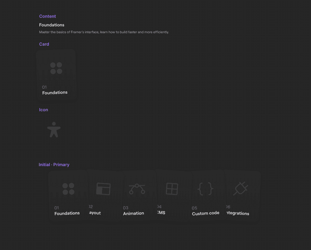
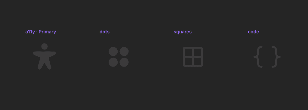
The number, title, and icon are all variables. I've nested an Icon component here so I only need a single variant for my card, this keeps things more manageable.
Give it a fixed width that allows for some breathing room on mobile, somewhere around 180–220px.
Foundations
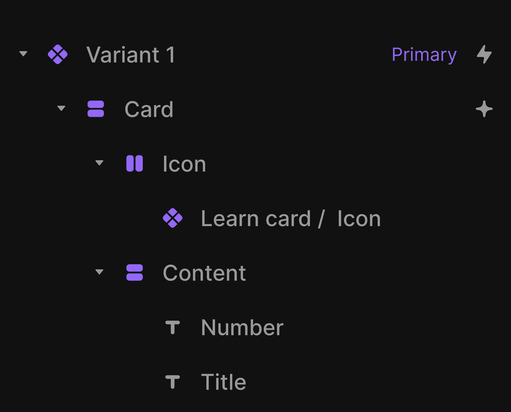
We want the rotation variable to be applied to the Card layer, not to the component itself.
This way we can ensure the bounding box for each card will remain the same.
Foundations
Layout
Foundations
Layout
02.
Create the content
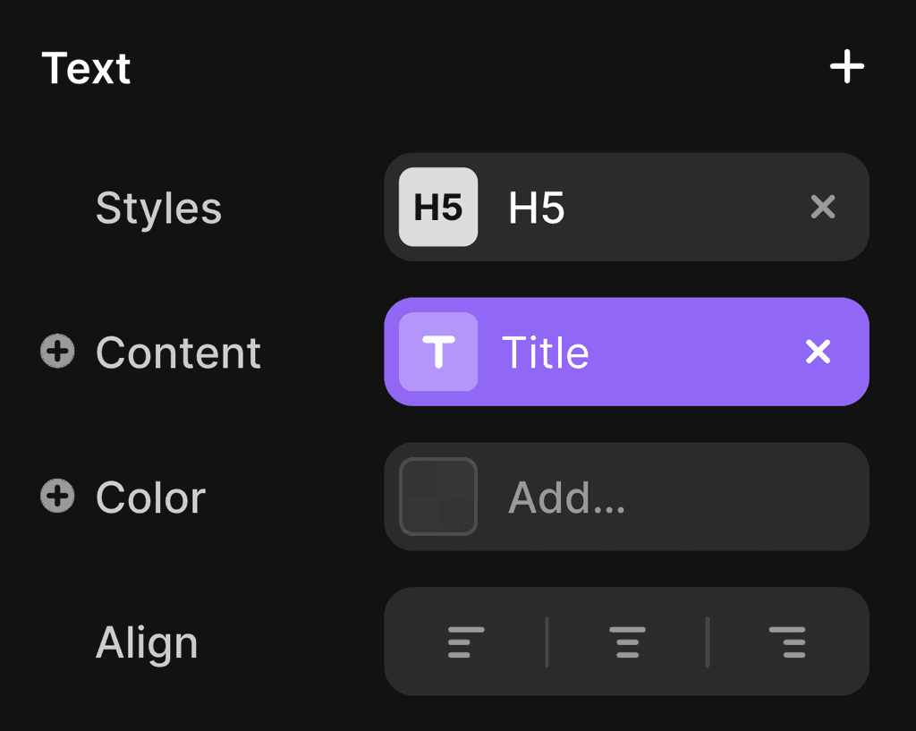
Create a new Content component. It's setup is quite simple — we'll get to animating it later.
For now just create a title and some body content, wrap them in a stack, set Align to left on the stack and ensure both the stack and the text layers are set to fill width and fit height.
Add a fade in appear effect with a .3s delay to ensure the cards have time to stack first.
Foundations
Master the basics of Framer's interface, build faster and more efficiently.
03.
Build the structure
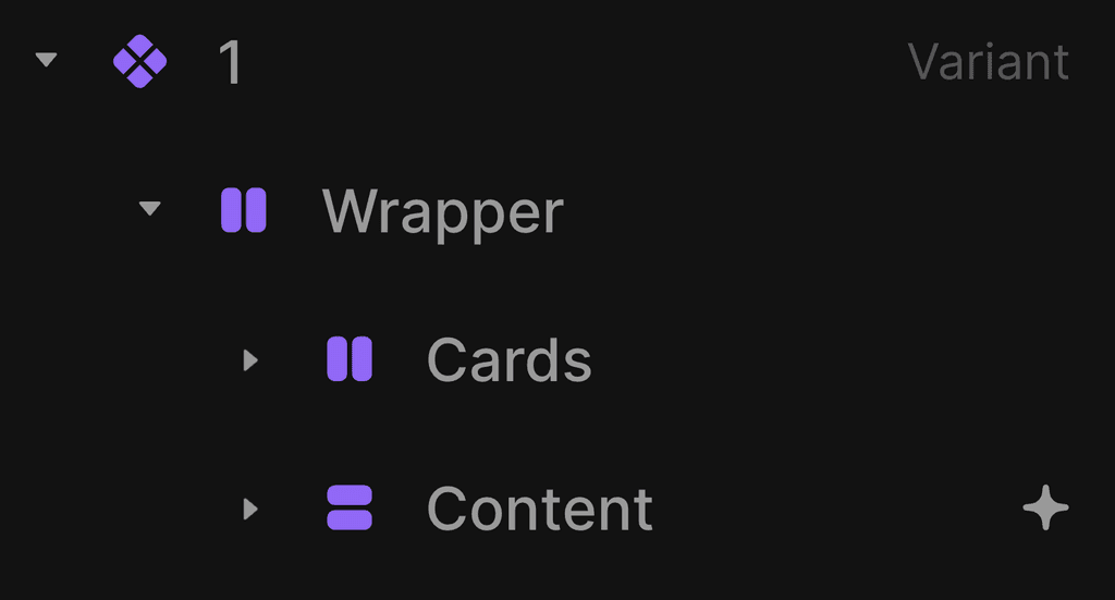
Create a horizontal stack with 6 cards in, no gap. Then create the content stack with 6 instances of the Content component. In both stacks I've numbered these 1–6 to help keep track.
We need a wrapper here to ensure our cards always overlap and are centred. We can set a max width on the component itself, but if we then set this to fill width on the canvas, it'll cluster the children at the start like this:

This happens even though we have our alignment and distribution set to centre. Instead we can nest our Cards and Content stacks inside a wrapper and set the max width there.
We have 6 cards at 185px width (1160 total) so let's set a max width of 960px on the Wrapper so there will always be some overlap.
Be sure to set overflow: visible on any wrapping frames so we don't clip out any shadows or descenders.
The arrows stack is set to the width of our card (185px) so it's optically centred. I've nested this inside the Cards stack and pinned it 0px left and -70px down.
Now for the content. Because I want to animate it, I need the titles to start in the same place. I've added 80px of top padding inside the Content stack.
80px
Keeping the canvas organised will pay dividends here. I like to pull out any nested components so I have easy access to hop back in and edit.
04.
Create the swap animation
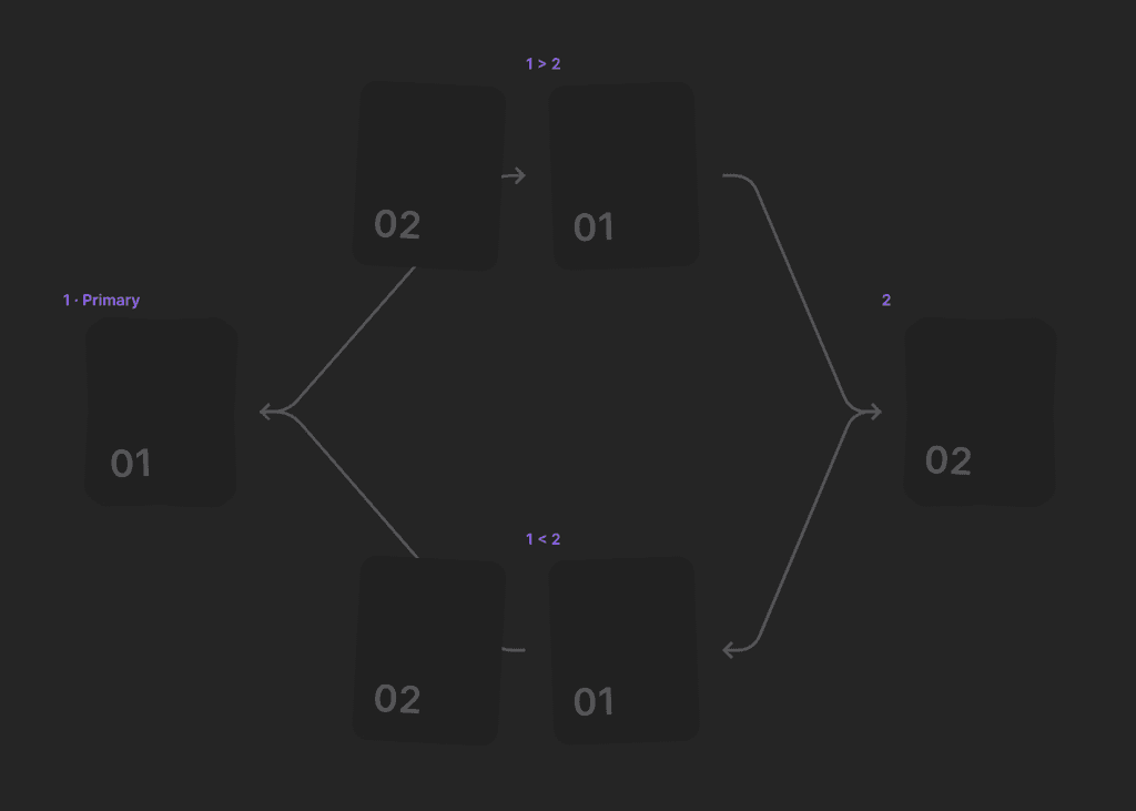
We'll be using interstitial variants to create the swapping effect. What we want to happen is for the card to move off of the stack before animating to the bottom.
To achieve this we need interstitial variants.
The key here is to add a delay on the appear effect so the out animation has time to complete. Without the delay Framer will animate between the two positions instantly.
Essentially we're creating a rudimentary form of keyframes (animation sequencing).
We'll use a similar setup for the blurred text animation later but for slightly different reasons.
We need interstitial variants between for each card, I like to name them 1 > 2 and 1 < 2, so I can identify them at a glance.
Here, card 1 has its position set to Absolute, pinned -250px on the left and 0px on the bottom.
01
02
Click to cycle
Now let's set position of the new top card to Relative so Framer can calculate the container size correctly.
You'll notice that if you set the height and width of a container to fit/fit but then change all of it's children to be absolutely positioned it will inherit old values for its size to avoid collapse.
A fit/fit stack with absolutely positioned children.
The same stack but with one child set to Relative.
05.
Make it responsive
Because we have the cards set to fill, they'll adapt to the screen width for the most part. The card component has a fixed width so it's going to extend beyond its bounding box which means we can't predict exactly what the full width will be.
For small screens we can skip the Initial variant and start with the first card visible.
To make this work we need to add a direction variable to the Wrapper.
80px
80px
Unfortunately we can't assign variables to text alignment yet.
This means we have a few options. The first is keeping the title and body will either have to stay left aligned, or we can set them to fit content and set alignment to centre on their parent stack.
The downside of this is that fill width allows for text wrapping which is helpful if a user has manually increased their browser text size.
The third option is
06.
Blur animation
What's actually happening here? Well, both
We're going to use interstitials again for this. But this time, instead of simulating keyframes/movement, we're essentially spoofing exit effects.
What are exit effects? Well, framer-motion (the motion library that powers Framer's animations) has a hook named AnimatePresence which allows us to create exit effects when something leaves the DOM — think dismissing a modal or hiding a notification.
However, this isn't natively supported in Framer yet (aside from within relative overlays), we can only animate IN (appear effects).
This means we can create beautifully smooth entrance effects but our content will always disappear instantly if it's visibility is set to off.
To work around this we keep the layer visible in the interstitial variant but drop the opacity, then set an appear
Essentially we need to toggle visibility off because we want the appear effect to run, but for that
Click the content below to cycle through.
07.
Finishing touches
We can avoid distracting cursor swapping by setting user-select to none on the text layers inside the content component.
You can access this property from the + inside styles once you've selected a text layer.

The 'show all links' option (search for this via cmd+/ or cmd+k or via File>View) allows us to visualise all of the interactions within our component.
This is incredibly useful for debugging more complex components where we have to be careful with breaking or overriding Framer's inheritance patterns.
Let's say you've set your left / right arrow interactions and then duplicated the variants to make your interstitials. This means those arrows are still interactive while the cards are swapping which will make our animations interruptible which we don't want. Show all links helps to catch these errors.
That's a wrap.
That's it for this lesson. I'll share the remix link in
I'm still finalising the curriculum (and title), so follow along for updates.
The aim is to dive deeper into how things work, explore the nuances of Framer, and consider the benefits and drawbacks of different approaches.
The course will be mostly video based but will also feature some technical deep dives like this one alongside exercises and materials for you to practice.
Here's what we'll be making. It's fully responsive that loops seamlessly, with content that blurs out and in.
Ensuring the animations are non-interruptible.
Let's dive in.
